Branding & Identity · Packaging · Social Media · Web
Camarónshine
A new seafood and cocktail restaurant in Mexico City, with no name recognition and no visual identity. We built the whole brand before opening day: logo, print, packaging, facade signage, website and social media.
00/01
The challenge
Challenge
A brand-new restaurant had to be recognisable from the first day, on the street, on the table and on Instagram.
Solution
One friendly, flexible identity built on a single symbol, three colours and a seafood pattern, documented in a brandbook.
Camarónshine was a new business: cocktails, ceviches, shrimp and tostadas. It had a menu and a location, but no name recognition and nothing visual to build on.
-
01
Recognised from day one. With no regulars yet, the brand had to do the work: easy to spot from the street and easy to remember after one visit.
-
02
Many touchpoints at once. Menus, cups, bags, napkins, the sign, a website and Instagram all had to launch together and look like one brand.
-
03
Fresh, fast and quality. The owners wanted a casual, friendly place, without looking cheap: the image had to say fresh food and quick service.
The brand's personality, in the owners' words
We are a brand with a fresh style. Speed of service is what defines us. Our biggest commitment is quality and freshness in every dish.
00/02
Our role
A two-person design team, a fellow designer and I, hired to create the restaurant's image from scratch. We covered the brand end to end, from the first sketch to the posts on launch week.
- Brand
- Personality, logo design and the brandbook with all the usage rules.
- Print & space
- Stationery, menus, packaging, coasters, merch and the facade sign.
- Digital
- The website, plus social media posts, reels and stories.
00/03
The logo
A simple symbol that's easy to recognise, plus the name. The shrimp curls into a "C" for Camarónshine, drawn with rounded lines that match the lettering, and red splashes give "shine" its energy. The symbol is built from four circles: body, head, tail and eye.
Built on a grid
One unit keeps everything in proportion. The grid uses the "C" of the name as its unit (1X = C). The same unit sets the clear space around the logo, so it always has room to breathe.
Positive, negative and one colour
Vertical and horizontal versions for different formats, white versions for dark backgrounds, and one-ink versions for cheaper printing. For one ink, any of the three brand colours can be used on its own.
- Versions
- 2
- Vertical and horizontal.
- Grid unit and clear space
- 1X = C
- The "C" of the name sets the proportions and the room around the logo.
- Minimum print size
- 2 cm
- 57 px wide on screen.
00/04
The visual system
Colour, type, a pattern and a photography style: a small kit that lets anyone produce new pieces that still look like Camarónshine.
Three colours, with a set balance
- 50%Navy blue
- #49468D
- 30%Red
- #E3332A
- 20%Salmon
- #F3A38E
Bar lengths show the recommended share of each colour. Light grey (#EBEBEB) and mid grey (#B2B2B2) support them.
Friendly, but clear
- Comfortaa · Primary
- The logo. Soft, round shapes: close and fun, but still professional. Clear in print and on screen.
- Poppins · Secondary
- Long texts. Structured and very legible. Its big family helps build hierarchy in menus and longer messages.
- Pulang · Decorative
- Highlights. A playful display face for short, punchy messages, like "Coming soon!".
Pattern
A seafood pattern that ties packaging together. Line icons of shrimp, fish, octopus, crabs and shells, drawn in the same style as the logo. It unifies the packaging and backs up ads and posts.
Photography
Full colour, close up, full of appetite. Photos should carry the feeling of the place: unusual angles and close details, always in full colour, at 300 dpi for print.
00/05
Applications
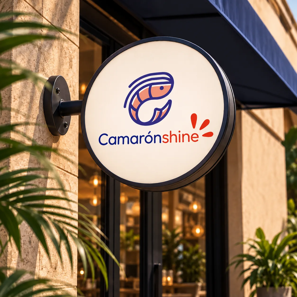
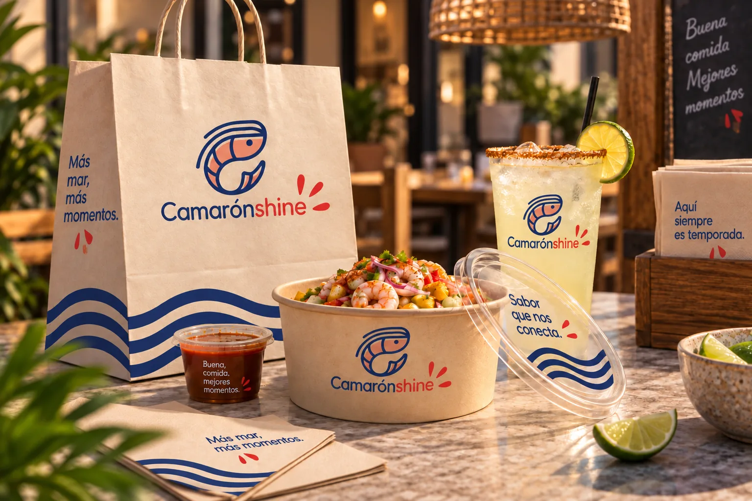
The system applied everywhere a guest meets the brand: from the sign outside to the cup in their hand.
- Facade sign
- Menu
- Paper mats
- Cups and bags
- Napkins
- Coasters
- Sauce labels
- Staff merch
00/06
Social media & web
We created the restaurant's Instagram content, reels, posts and stories, and designed its website. Instagram is where the brand did most of its day-to-day work.
Instagram · All reels
- Views across 24 reels
- 48K+
- Reels past 1,000 views
- 8
Instagram · Top reels
- Views on the top reel, ~32× the followers
- 19.8K
- Views on the "Nos vemos" reel
- 5,985
View counts shown on Instagram for 24 reels on the account, September 2026, about 2,000 per reel on average. Followers: 608. Open the feed (@camaronshine_oficial)
Short, real and made in the kitchen
Most content was vertical video shot at the counter: cocktails being built, dishes being plated, orders being packed. It showed the promise of the brand, fresh food and fast service, instead of just saying it.
What we posted
- Reels of the prep line and signature dishes
- Branded posts and stories with the colours, type and pattern
- Humour and interactive stickers, like polls, to get people talking
The website
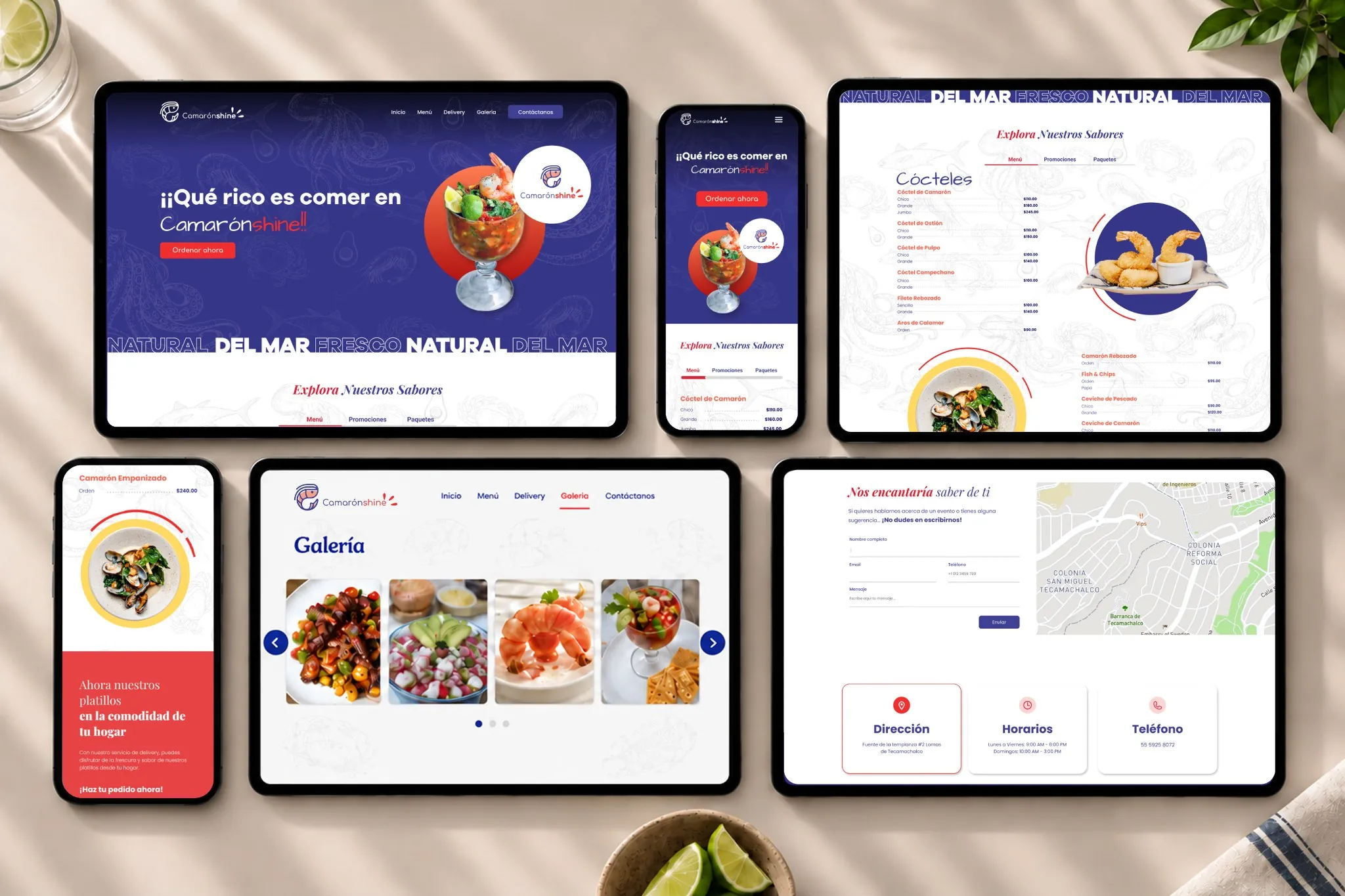
A responsive site that carries the same colours, type and waves: dishes up front, a menu by category, a photo gallery and contact details with a map. The restaurant has since closed and the site is no longer online.
00/07
Outcome
Camarónshine opened with a complete, consistent brand: one symbol, three colours and one pattern, carried from the street sign to the Instagram feed, where its reels passed 48K views.
- Brand
- Logo in vertical and horizontal versions; positive, negative and one-colour versions; colour palette, typography, pattern and photo style; a 15-page brandbook.
- Touchpoints
- Stationery, menu and paper mats; cups, bags, napkins, coasters and sauce labels; facade sign and staff merch; website and Instagram content.
A complete brand, ready for opening day.